TextBox
Last modified by Achraf El Kari on 2023/07/18 18:58
In the TextBox component, we find 6 tabs: 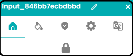
*General Config :
In the General Config, we find 4 sections: Type, Label, Data, Input.
Type :
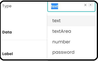
Type Element | Description |
|---|---|
| text : | This is the basic type for entering text. Users can enter alphanumeric characters, symbols, and spaces in this type of textbox. |
| textArea : | "It allows users to enter longer text. It is often used for comments, descriptions, and similar purposes. |
| number : | This type of textbox is specifically designed for entering numerical values. |
| password : | This type of textbox hides the characters entered by the user. It is used for password fields. |
Data, Label & Input:
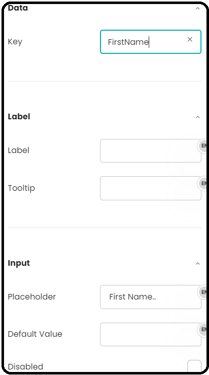
Element | Description |
|---|---|
| Data: Key | We have the 'Key' field to define the data type associated with this textbox field. It is also possible to manually enter a key. |
Label:It consists of two elements: Label and Tooltip | |
| Label: | It is used to provide a description or indication of the type of information expected in the textbox |
| Tooltip: | A tooltip is a small element that provides additional information or contextual hints when a user hovers over a specific element. 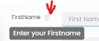 |
Input:It consists of three elements | |
| Placeholder: | It is a brief informative text that appears inside the input area when it is empty, to indicate to the user the type of information expected |
| Default Value : | It is a feature that allows pre-filling an input field with an initial value |
| Disabled : | When the text field is disabled, it is not clickable, selectable, or editable by the user. This means that the user cannot enter or submit data through this element |