Switch & CheckBox
Last modified by Achraf El Kari on 2023/08/10 16:26
In the Switch & CheckBox component, we find 4 tabs: 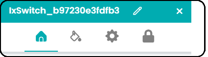
Switch (CheckBox) Config :
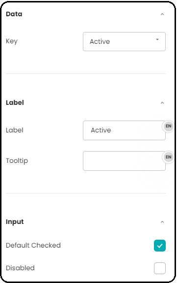
Type Element | Description |
|---|---|
| Data: Key | We have the 'Key' field to define the data type associated with this Switch(CheckBox) field. It is also possible to manually enter a key if the form is not associated with a tracking type. |
Label:It consists of two elements: Label and Tooltip | |
| Label | It is used to provide a description or indication of the type of information expected in the Switch(CheckBox). |
| Tooltip | A tooltip is a small element that provides additional information or contextual hints when a user hovers over a specific element. |
Input:It consists of two elements | |
| Default Checked | Refers to the initial state of a Switch (checkbox) input element where the checkbox is pre-selected or "checked" by default when the page or interface is loaded |
| Disabled | When the element is disabled, it typically appears visually distinct (e.g., grayed out) to indicate that it is not available for interaction. |