Bouton
Last modified by Achraf El Kari on 2023/07/18 16:11
In the Button component, we find 4 tabs:
Général Configuration, Styles, Actions and Permissions 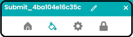
1-Général Configuration :
- There are two types of buttons
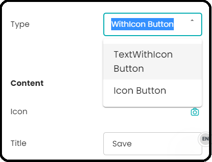
Buton Type | Description |
| TextWithIcon Button : | This type allows us to choose an icon and write a title for the button |
| Icon Button : | It displays the icon that the user chooses |
2-Styles :
We have two parts: Container and Content 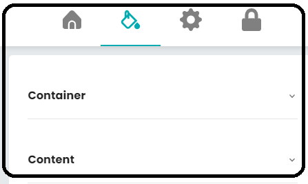
Container :
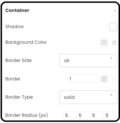
Container element | Description |
|---|---|
| Shadow: | To add a shadow to the button |
| Background Color: | To change the background color of the button |
| Border Side : | To define where you want to position the button border (all, left, right, top, bottom) |
| Border: | To change the color and thickness of the button border |
| Border Type: | To change the type of button border (dotted, solid, ...) |
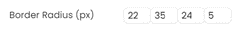
| Border Radius (px): | To define the radius of the button's rounded corners. |

Content :
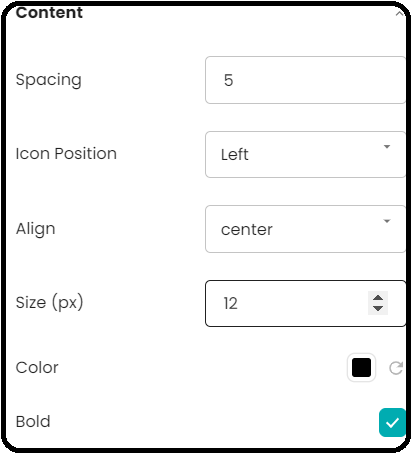
Content element | Description |
|---|---|
| Spacing: | To define the spacing between the icon and the text in the button |
| Icon Position: | To choose the position of the icon (left, right, top, bottom) |
| Align: | To align the icon with the text (left, center, right) |
| Size (px): | To define the size in pixels of the icon and text in the button |
| Color: | To change the color of the icon and text in the button |
| Bold: | To make the text bold in the button |